 Thanks to everyone for your amazing feedback about my Revolution project. I have received a number of comments and emails from visitors to my blog asking some very specific questions about Revolution, including requests that I share the process that goes into creating the individual pieces. I have started to list the ingredients and I thought it might be interesting to take you on a step-by-step look into the making of one of my relatively simple pieces which I call Time is Running out. So, in pictures and in words, here is the evolution of revolution:
Each piece begins on notched cardstock that is a little larger than 2 1/2 x 3 1/2 inches. In this piece, the cardstock was covered with a light colored paper and, as can be seen in this picture, partially painted with the first layer of acrylic paint.

In this second picture, a second color of acrylic paint was added without completely covering the first layer. In some pieces I will add additional layers of different color acrylics as well.

Here I have added some random scribbling in complimentary colors using my favorite brand of wax pastels -- Caran D'Ache. I have used both water soluble neocolor II and metallic neocolor I. On those pieces that I add further layers of acrylic paint, I will also add addtional wax pastel, and often altered bits of paper, between each layer.

On the right side you can now see the addition of a dry transfer. This adds additional depth to the piece.

This is the part I like best and the one that usually adds the most texture to my pieces. Using several colors of acrylic paint, I place scattered lines across the page using the edge of a bookboard. For narrower lines I use the edge of a fake credit card...you know the ones we all receive in the mail as part of credit offers. On this piece, the lines are relatively ordered and run both horizontally and vertically. Click to enlarge this image to better see the texture.

More acrylic paint was added here in two steps. First, I used bubble wrap lightly coated with paint to add distressed-looking circles. Then I splattered away using white acrylic paint thinned with a little water. I now felt that the background was done.

Once the background is complete, I will add the main images. Usually that consists of altered paper, an altered photo, or a transparency. However, for variation and simplicity, I used a rubber stamp and rub on letters in this piece. I stamped the image of the faucet using dye ink and then outlined the stamped image using a uni-ball pen to darken. Then I added the letters.

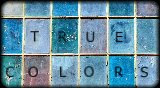
This is the completed piece. Although hard to tell from the photo, I edged the entire piece with black dye ink as a way to frame the art. I almost always feel that my artwork looks better when edged with ink, paint, paper, or another medium.
I hope the evolution of revolution was interesting and useful. I am always inspired when an artist shows me their process step by step. Hopefully you were inspired too. In fact, if any of you create something using this combination of techniques, please feel free to leave a link to your work in the comment section or email an image and I will post it.


16 comments:
Great tutorial Seth! Very well broken down and easy to follow. And thanks for your comments on my blog about my watercolors. Getting back to basics and playing with paint can be a very mediational experience and something I should certainly do more often. ;)
-Sarah
www.caspiana.com
Thanks for the step-by-step process Seth, I love reading about how other artists achieve their creations.
I like how you have framed your work with the darker ink, it makes it pop!
Love this tutorial, Seth. hanks for sharing it. It always so interesting to see how others work.
What a great tutorial! It is well written and the pictures are great!!
Brilliant tutorial! Thank you.
Hi Seth, I would like to pass on to you an "Excellent Award" if you care to know more, please check out my blog.
regards
karen
Seth, thanks so much for sharing your techniques. Another artist that I admire who has also done this is Ann Baldwin.
(www.annbaldwin.com)
I hope you share more evolutions with us in the future.
fantastic seth; the process always intrigues me. I love the depth you manage to create; thanks for sharing. Brilliant end result by the way.
thank you, seth! that was great! i love seeing what others do...
Brilliant step-by-step. I just love the tap image. I always wondered how you got such great texture into your work. Now I know and will have to give it a try.
Excellent! Thank you for the tutorial!!!
Cool! I enjoy seeing how people create a piece of artwork. Great idea for the image, too, Seth.
Really great techniques , and aren't those Caran D'Ache wax pastels just the best thing on earth? I can't live without mine!
Just added you to my blog roll-thought I had already done that, but I guess not. Its there now :)
This is fabulous. Thank you. I am really eager to work up one of these and play with paints and images.
The finished product is great, too!
Seth, Being able to see the Process of your work really brings each layer to life & makes me look deeper into all your other pieces & seeing hidden surprises. thank you Gwen
seth, you are amazing my friend!
Post a Comment