Perspective
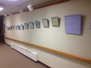
I currently have an exhibition of new work at The Gallery Link, which is part of the Ellenville Public Library and Museum in the Hudson Valley in New York. The exhibition opened on March 1 and runs through April 23. There was an official opening on March 26 along with an artist talk to celebrate the release of The Pulse of Mixed Media.
The exhibition consists of two series of paintings: Interior Angles and Passages, the latter of which will be featured in a future post.
Center of Gravity
Altitude
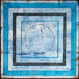
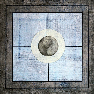
The 12 pieces from Interior Angles represents a different direction for me. They are all created on 12" x 12" wood cradled panels and are abstract acrylics. No mixed media to be found, although by clicking on and enlarging these images, you might be able to get an idea of the layers and texture that make up these pieces.
Concentric
This series is very personal. It represents contrasts. The background and underpainting, much of which cannot be seen, are spontaneous, random, and free - almost chaotic.
Algorithm
Segment
Locus
The surface is structured, bounded, and restricted.
Compass
Target
Magnitude


27 comments:
Beautiful compositions.
I love the colors.
Congratulations on your exhibit Seth. Looks almost like your very own gallery. Great series- love this new art style- the colors, new twist in designs, and the description of meaning behind your work!
Jill said it well...congrats Seth!I see connections between all your work,altered and painted. I love the freshness of these.
Interesting as I'm just reading about Isaac Newton. Who new math could foster such creativity. Good for you!
Congratultions Seth! you deserve it! Wonderful works!
congratulations Seth!
so interesting - this circling
circles
have been finding me
as well lately
3 are on their way
to PO box 2036
I have a post up
about these
and the 3 questions
some serious pondering
thanks so much
xox - eb.
There is a great deal going on under the surfaces of what appears, at first glance, to be simple and spare in these geometric compositions. The layers of underpainting, creating subtle textures, and depth, in these pieces, act as a foil, or contrast, to the hard-edged geometric shapes, lines, and patterns of the major imagery. Muted colors add another unexpected element, giving the pieces a dimensional quality they would otherwise not possess. An interesting new direction for you, Seth! It is wonderful that they could all be seen in a public space, together, as a group. Congratulations!
Congratulations on your exhibit! I love your new art, so rich! Yes, one can 'feel' that there's a lot going on under it's surface, I can't take my eyes of of them. 'Altitude' is just stunning!
Eeck... I accidently hit the 'anonymous' button, former comment was mine, Marit.
Seth, I am really liking your new work. The pieces look ancient, wise and spiritual and at the same subtle and personal. So much going on!
Would love to see the exhibit.
Great show! Interesting hanging of paintings. Isn't it exciting to watch people looking carefully at your art?
Wishing you many sales and many more hours of happy creating.
I love "Concentric" and "Target" reminiscent of Jasper Johns, but with a wonderful Apter-ness. Beautiful work, Seth!
Erin
Great show Seth! and continued good success!!
isn't it wonderful to see your work on gallery walls? congrats to you so well deserved..
These are really beautiful. I think Target is my favorite. The colors and textures are really nice. Congratulations on your show!
You are certainly getting lots of exposure Seth... good for you.
These are so handsome, individually and hanging as a group.
Ah, so that's your angle! Very cool. I love the shades of blue.
So wonderful that with all you do, you've found time to venture into a new direction.
I love abstract, and these are beautiful and intriguing.
Even the title of the series is applause worthy!
incredible pieces! congrats on the exhibit seth!!
These are wonderful, Seth, congratulations on this exhibition. I love the combination of depth and pure shapes.
love these seth! the texture is beautiful and the juxtaposition with the very precise shapes is great. nice show!
Seth these are truly amazing. I love the hardness of the geometry contrasted with the layered and soft texture of the underpainting. I find the juxtaposition of the geometric and the organic very compelling. Of course, we think of geometry as being hard, uncompromising and "unnatural" but in fact it is the opposite. Geometry is everywhere in nature and gives us our most profound understanding of our natural environment. I think these are your best works yet. I hope you continue to explore painting. Congratulations.
I forgot to say that my personal favourites are Segment with it's gentle palette and open rectangular areas - like doors inviting you in, and Concentric - gorgeous palette and who doesn't love a circle, such a nurturing shape and so fundamental to all geometry.
wow love - unstructured but bounded. I think Locus is my favorite, but I am a straight line kind of girl. Wonderful work, wish I could see it in person
I find this works absolutely fascinating. I wish I lived closer so I could see it in person.
Really great post.I love your blog, Thanks for sharing !
Post a Comment